“Transform your digital canvas into a masterpiece with Elementor — where creativity meets simplicity, empowering you to effortlessly craft stunning websites through intuitive drag-and-drop design.” https://bit.ly/4812QMr
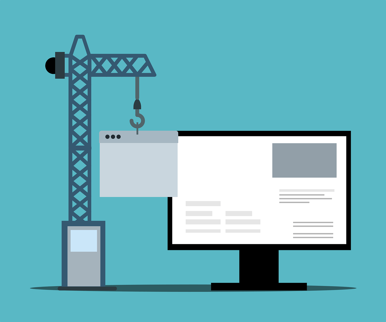
I. Introduction
In the ever-evolving landscape of web design, where every pixel matters, headers and footers emerge as silent influencers, orchestrating the symphony of user experience. While the main content steals the spotlight, these bookends of your webpage play a crucial role—they frame the narrative, guide the navigation, and leave a lasting imprint. In this comprehensive guide, we’re about to embark on a journey into the realm of custom headers and footers, and our tool of choice is Elementor, the virtuoso of WordPress page builders.
Picture this: a visitor lands on your website. The header is the first handshake, the initial greeting, setting the tone for what lies within. It’s the ambassador of your brand, offering a sneak peek into your identity. Conversely, as users scroll down, the footer bids them farewell—it’s the lasting impression, the final note in the symphony of user interaction.
Now, as we unravel the intricacies of crafting custom headers and footers, we’re not just tweaking aesthetics; we’re enhancing functionality, optimizing navigation, and ensuring a seamless user journey. Elementor, our toolkit for this creative venture, isn’t just a page builder; it’s a gateway to a world where your website transforms from a digital space into an immersive experience.
So, buckle up as we explore the profound impact of these seemingly humble elements on your website’s identity and user engagement. Let’s dive into the art of customization, where every pixel tells a story, and every aspect is a brushstroke on the canvas of your digital presence. Get ready to unleash your creativity and redefine the first and last impressions your website makes. Welcome to the guide that turns your headers and footers from overlooked features into the stars of your web design symphony.
II. Understanding Elementor
Now that we’ve entered the world of custom headers and footers, we must acquaint ourselves with the maestro orchestrating this transformative symphony—Elementor. Imagine having a tool that simplifies the intricate process of web design and empowers you with a creative playground where your visions can materialize effortlessly. That’s Elementor—a WordPress page builder that transcends the ordinary.
Elementor is more than just a drag-and-drop editor; it’s a game-changer for those seeking a dynamic and visually appealing online presence. Its intuitive interface opens the door for users with varying levels of expertise, making web design accessible to everyone, from seasoned developers to those taking their first steps into the digital realm.
What sets Elementor apart is its versatility. With a comprehensive set of design elements and widgets, you’re not limited by pre-defined templates. Instead, you can sculpt your website according to your brand’s unique identity.
Navigating through Elementor is akin to having a palette of possibilities. From adjusting layouts with a simple drag to fine-tuning styles with just a click, the user-friendly interface ensures a seamless design process. And don’t let its simplicity fool you—Elementor is a powerhouse capable of creating intricate, professional-grade websites without coding expertise.
Whether envisioning a sleek corporate site or a vibrant personal blog, Elementor provides the tools to turn your ideas into a pixel-perfect reality. With its real-time editing feature, you witness the changes as they happen, fostering a dynamic and efficient design workflow.
In essence, Elementor is not merely a page builder; it’s a catalyst for innovation in the digital realm. Elementor will be our trusted companion as we progress through this guide, empowering us to transform static headers and footers into dynamic, engaging elements that resonate with your audience. So, let’s not just understand Elementor; let’s embrace it as the canvas on which we’ll paint the masterpiece of custom headers and footers.
III. The Significance of Custom Headers and Footers
Why bother customizing headers and footers when the primary content often steals the limelight? The answer lies in understanding the profound impact these often-overlooked elements have on user experience and the overall success of your website.
*Headers as Brand Ambassadors:*
Imagine your website as a storefront. The header is your welcoming signage—a digital marquee that introduces visitors to what lies within. It’s not just a navigation bar; it’s a brand ambassador, embodying your identity in a concise space. Custom headers allow you to infuse personality, color schemes, and brand elements, creating an immediate connection with your audience.
*Footers as Lasting Impressions:*
As users scroll through your content, the footer is the curtain call. It bids farewell but leaves a lasting impression. Often underutilized, custom footers are an opportunity to reinforce your brand message, provide essential links, or even spark engagement. An artfully crafted footer ensures the user journey concludes positively, encouraging further exploration.
*Enhancing User Experience:*
Headers and footers are the anchors of navigation. A well-designed header ensures that users can effortlessly find what they’re looking for a specific page, contact information, or a call-to-action button. On the other hand, when customized intelligently, footers provide a secondary navigation space, offering a safety net for users who might have scrolled past crucial information.
*Differentiation in a Sea of Sameness:*
In a digital landscape saturated with websites, standing out is paramount. Generic headers and footers might fulfill functional requirements, but custom ones elevate your website from the commonplace. They become memorable touchpoints, contributing to the distinct identity that sets you apart from the crowd.
*SEO and Accessibility:*
Beyond aesthetics, custom headers and footers play a role in search engine optimization (SEO). Straightforward navigation, strategic placement of keywords, and well-organized content contribute to a website’s SEO performance. Additionally, accessibility features, such as easy-to-read text and navigation menus, are seamlessly integrated into well-designed custom headers and footers, ensuring your website is inclusive and user-friendly.
Custom headers and footers are not mere embellishments but strategic elements that influence how users perceive, interact with, and remember your website. As we delve into the customization process with Elementor, remember that every tweak you make to these sections is a step towards creating a memorable and user-centric digital experience.
IV. Getting Started with Elementor Headers
Now that we’ve set the stage, it’s time to roll up our sleeves and dive into the practicalities of crafting compelling custom headers using Elementor. This section is your gateway to unleashing creativity and transforming the mundane into the extraordinary.
*Accessing Element or Header Customization:*
The first step on this journey is accessing the header customization options within Elementor. Navigate to your WordPress dashboard, select the page you wish to customize, and click the “Edit with Elementor” button. Once you’re in the Elementor editor, look for the dedicated section that allows you to customize your header.
*Choosing a Header Template:*
Elementor offers a range of pre-designed header templates to kickstart your customization process. These templates serve as a canvas for creativity, providing a foundation to modify according to your brand aesthetics. Browse the available options, select a template that aligns with your vision, and let the customization journey begin.
*Drag-and-Drop Elements:*
One of Elementor’s standout features is its intuitive drag-and-drop interface. Want to rearrange the elements in your header? Drag them to the desired position. Need to add a new element or widget? Drag it from the Elementor panel onto your header canvas. This user-friendly approach makes customization a visual and interactive experience.
*Customizing Styles and Layouts:*
Elementor doesn’t just stop at placement; it offers various styling options to ensure your header aligns with your brand identity. Every aspect is customizable, from choosing fonts and colors to adjusting spacing and alignment. Experiment with different layouts until you find the one that resonates with your brand’s personality.
*Incorporating Brand Elements:*
Your header is the beacon of your brand on the digital landscape. Integrate your logo, brand colors, and other visual elements that define your identity. Elementor allows you to seamlessly upload and customize these elements, ensuring that your header visually represents your brand.
*Mobile Responsiveness:*
In the age of smartphones, ensuring your header looks impeccable on various devices is crucial. Elementor simplifies the process of achieving mobile responsiveness. Toggle to the mobile view within the editor and make adjustments specific to smaller screens. This ensures a consistent and polished look across all devices.
*Preview and Save:*
Previewing your header before making it live is prudent as you make changes. Elementor provides a real-time preview feature, allowing you to see how your custom header will appear to visitors. Once satisfied, hit the save button to preserve your masterpiece.
This is just the beginning of your Elementor header customization journey. The tool’s flexibility and user-centric design make it a playground for experimentation. So, as you navigate through the customization options, remember that each tweak brings you closer to a header that not only captivates but also strategically guides your audience through your digital space. Happy customizing!
V. Designing Unique Headers: Tips and Tricks
Now that we’ve ventured into Elementor headers, let’s elevate our customizations by exploring some invaluable tips and tricks. Crafting a unique title isn’t just about aesthetics; it’s about creating an immersive and functional experience that leaves a lasting impression.
*1. Consistency is Key:*
Maintain a consistent design language throughout your website. Your header is a visual anchor, and a harmonious design ensures that users feel a sense of coherence as they navigate different sections.
*2. Strategic Use of Colors and Fonts:*
Colors and fonts are potent tools for brand expression. Choose a color palette that aligns with your brand identity, and experiment with fonts to balance readability and aesthetics. Consistency in these choices contributes to a professional and polished look.
*3. Simplify navigation:*
A cluttered header can overwhelm visitors. Prioritize essential navigation links and features, ensuring users can quickly find what they want. The header is not the place for information overload; simplicity enhances user experience.
*4. Engaging Call-to-Action (CTA):*
If your website has specific goals, such as encouraging sign-ups or promoting products, incorporate a compelling call-to-action in the header. A well-designed CTA guides users towards desired actions, whether a button or a strategically placed link.
*5. Optimize for speed:*
While customizing, be mindful of performance. Large image files or overly complex elements can impact loading times. Optimize images, use Elementor’s built-in optimization features, and ensure your custom header doesn’t compromise your website’s speed.
*6. Test Across Devices:*
Responsive design is non-negotiable. Test your header on various devices to ensure it looks and functions seamlessly on desktops, tablets, and smartphones. Elementor’s responsive editing features make this process straightforward.
*7. Incorporate Brand Imagery:*
If your brand has distinctive visual elements, such as icons or illustrations, consider incorporating them into your header design. This reinforces brand identity and adds a personalized touch to the user experience.
*8. Balance Visual Appeal and Functionality:*
While aesthetics are essential, functionality should not be compromised. Ensure your custom header helps navigation and overwhelms users with intricate design elements. Striking a balance between visual appeal and functionality is the hallmark of an effective header.
*9. Utilize Elementor Pro Features:*
If you have Elementor Pro, explore advanced features such as sticky headers, which stay visible as users scroll. This enhances navigation accessibility and adds a touch of sophistication to your website.
*10. Seek User Feedback:*
After implementing your custom header, gather feedback from real users. Their insights can uncover usability issues or provide valuable perspectives on the design. User feedback is a continuous improvement loop that ensures your header evolves with user preferences.
Remember, designing a unique header is an iterative process. Experiment, gather feedback, and refine. Elementor’s flexibility empowers you to fine-tune your header until it perfectly aligns with your brand vision and enhances the overall user experience. So, let your creativity flourish, and design a header that captivates and guides your audience.
VI. Elementor Footer Customization
As we shift our focus from the header to the often underestimated but equally impactful footer, Elementor remains our trusty companion in the web design journey. Much like the credits in a movie, the footer is your website’s conclusive note, and Elementor ensures that this final impression is memorable.
*1. Accessing Footer Customization:*
Like the header, the first step is to access the Elementor editor and locate the dedicated section for footer customization. Navigate to your WordPress dashboard, select the page you want to modify and click “Edit with Elementor.” Once within the editor, you’ll find the footer customization options waiting for your creative touch.
*2. Choosing a Footer Template:*
Elementor offers a variety of pre-designed footer templates to jumpstart your customization process. These templates serve as a canvas, giving you a foundation to build upon. Select a template that aligns with your brand aesthetics and the overall design language of your website.
*3. Widget-Powered customization:*
Elementor’s strength lies in its widgets; the footer is the perfect canvas for showcasing their versatility. Drag and drop widgets to add elements like a newsletter subscription form, social media icons, or a recent posts section. This widget-powered customization ensures that your footer isn’t just a farewell but a functional space.
*4. Styling Your Footer:*
Just like the header, the footer deserves careful attention to styling. Customize fonts, colors, and spacing to ensure visual consistency with the rest of your website. A cohesive design language between the header and footer creates a seamless user experience.
*5. Brand Elements in the Footer:*
The footer is an excellent place to reinforce your brand identity. Include your logo, brand colors, or other visual elements defining your online presence. This subtle repetition enhances brand recall and leaves a professional imprint.
*6. Copyright Information and Legal Links:*
The footer is also the conventional location for copyright information, legal disclaimers, and links to privacy policies or terms of service. Ensure your footer complies with legal requirements and provides users with essential information.
*7. Mobile Responsiveness:*
Mobile responsiveness is paramount with users accessing websites from various devices. Toggle to the mobile view within the editor and make adjustments to the footer layout to ensure a seamless experience on smaller screens.
*8. Experiment with Elementor Pro Features:*
If you have Elementor Pro, explore advanced features like sticky footers or dynamic content integration. These features add a layer of sophistication to your footer and enhance user engagement.
*9. Create a Visual Hierarchy:*
Consider the visual hierarchy within your footer. Arrange elements in a way that guides users naturally. For example, place important links or contact information prominently, ensuring users can find what they need effortlessly.
*10. Preview and Save:*
Before making your custom footer live, use Elementor’s real-time preview feature. Ensure your changes align with your vision and enhance your website’s aesthetic and functionality. Once satisfied, hit the save button.
With Elementor’s intuitive tools at your disposal, customizing your footer becomes a creative endeavor. It’s not just a concluding note; it’s an opportunity to add functionality, reinforce your brand, and leave a lasting impression. As we progress in this customization journey, let your footer reflect the same level of care and creativity as the rest of your website. Happy customizing!
VII. Integrating Widgets for Enhanced Functionality
Now that we’ve laid the groundwork for headers and footers, it’s time to delve into the heart of customization—Elementor’s widgets. These versatile building blocks are the secret sauce that can transform your headers and footers from static elements into dynamic, functional components that engage and captivate your audience.
*1. The Power of Elementor Widgets:*
Elementor widgets are like digital Lego pieces you can stack, rearrange, and customize to build your dream design. In the context of headers and footers, gadgets go beyond mere decoration; they add layers of functionality that enhance user interaction and elevate the overall user experience.
*2. Navigational Widgets for Headers:*
For headers, widgets such as the Navigation Menu or Nav Menu Pro can create a seamless and intuitive navigation experience. Drag these widgets into your header canvas, and you can customize menu styles, add dropdowns, or even include mega menus for a more sophisticated navigation structure.
*3. Call-to-Action Widgets:*
Headers are prime real estate for strategic calls to action. Utilize widgets like Buttons or Icon Box to craft compelling CTAs. Whether it’s prompting users to subscribe to a newsletter, explore your latest products, or get in touch, these widgets are your tools for driving specific actions.
*4. Social Media Integration:*
Integrating social media icons is a widget-driven task in both headers and footers. Use Elementor’s Social Icons widget to add links to your social profiles effortlessly. This enhances your website’s connectivity and reinforces your brand’s platform presence.
*5. Footer Widgets for Information:*
In the footer, widgets come into play for displaying crucial information. The Text Editor widget is handy for presenting copyright information or legal disclaimers, while the Recent Posts widget can dynamically showcase your latest blog content.
*6. Newsletter Subscription Forms:*
Are you building a mailing list? The Form widget in Elementor enables you to embed a newsletter subscription form directly into your header or footer. This seamless integration encourages user engagement and streamlines the subscription process.
*7. Advanced Features with Elementor Pro:*
If you’re using Elementor Pro, you unlock a treasure trove of advanced widgets. Pro features like the Posts widget allow you to dynamically display blog posts, creating a dynamic and ever-changing element within your headers or footers.
*8. Dynamic Content Widgets:*
Elementor’s Dynamic Content widgets are a game-changer for those aiming for a personalized touch. Embed dynamic elements like user names, customized greetings, or even WooCommerce product listings directly into your headers or footers.
*9. Experiment with Design Elements:*
Widgets aren’t just functional; they contribute significantly to the aesthetic appeal of your design. Experiment with the Icon List widget for a visually engaging display of information, or use the Image Carousel widget to add a touch of dynamism.
*10. Ensure Mobile Responsiveness:*
As you integrate widgets, remember to toggle to the mobile view within the editor to ensure that your design remains sleek and functional across all devices. Elementor’s responsive editing features make this process intuitive.
Incorporating widgets is where the magic happens in Elementor customization. These elements enhance functionality and allow you to infuse creativity and interactivity into your design. So, as you navigate the myriad widgets at your disposal, think beyond decoration—think about how each device can contribute to a richer, more engaging user experience. Happy widget crafting!
VIII. Responsive Design: Ensuring Compatibility Across Devices
In a world where digital experiences span many devices, from expansive desktop monitors to pocket-sized smartphones, the importance of responsive design cannot be overstated. In this section, we’ll explore how Elementor facilitates the creation of headers and footers that seamlessly adapt to varying screen sizes, ensuring a consistent and user-friendly experience across the digital landscape.
*1. Mobile-First approach:*
Responsive design begins with a mobile-first mindset. Given the prevalence of mobile browsing, starting your design process by optimizing for smaller screens ensures a solid foundation. Elementor’s editor allows you to toggle effortlessly between device views, letting you fine-tune your headers and footers for desktop, tablet, and mobile displays.
*2. Element or’s Responsive Editing Features:*
Elementor simplifies the process of achieving responsiveness with its dedicated set of responsive editing features. When customizing your headers and footers, use these tools to adjust spacing, font sizes, and element visibility for different devices. The changes you make in the mobile view won’t affect the desktop version, providing granular control over your design.
*3. Testing Across Devices:*
After making adjustments for responsiveness, thorough testing is crucial. Preview your headers and footers on various devices to ensure the visual appeal is maintained and functionality isn’t compromised. This step is integral to delivering a seamless and enjoyable user experience.
*4. Navigation Simplification for Mobile:*
Headers often host navigation menus, and on mobile devices, space is limited. Simplify navigation for mobile users by utilizing Elementor’s features to create condensed menus, hamburger icons, or dropdowns. This ensures that users can easily navigate your website regardless of their device.
*5. Image Optimization for Speed:*
Responsive design isn’t just about appearance; it’s about performance, too. Optimize images within your headers and footers to ensure quick loading times on mobile devices. Elementor’s optimization features and thoughtful image choices contribute to a smoother mobile experience.
*6. Consider Touch Interaction:*
Mobile users interact with touchscreens, and Elementor allows you to customize elements for touch interaction. Adjust button sizes, spacing, and interactive features to accommodate touch gestures, ensuring a seamless and frustration-free experience for users on touch-enabled devices.
*7. Fluid Grids and Flexible Layouts:*
Elementor’s responsive design capabilities extend to creating fluid grids and flexible layouts. This ensures that your headers and footers adapt gracefully to different screen sizes, maintaining a visually appealing and balanced composition.
*8. Elementor Pro’s Sticky Headers:*
If you have Elementor Pro, take advantage of the Sticky Header feature. This ensures that your header remains visible at the top of the screen as users scroll, enhancing navigation accessibility on desktop and mobile devices.
*9. Regularly Check and Update:*
The digital landscape evolves, and new devices with varying screen sizes are introduced regularly. Periodically revisit your headers and footers to ensure ongoing compatibility with emerging devices. Elementor’s commitment to updates ensures you stay at the forefront of responsive design practices.
*10. User-Focused iteration:*
Responsive design is not a one-time task but an ongoing process. Use user feedback and analytics to identify potential issues on specific devices. Iterate your headers and footers based on fundamental user interactions to continually enhance the responsive experience.
In essence, responsive design with Elementor is not a checkbox; it’s a commitment to delivering a seamless, accessible, and visually pleasing experience across the diverse array of devices that users utilize. As we navigate the nuances of responsive design, remember that the goal is not just adaptability—it’s excellence in user experience, regardless of the screen size. Happy optimizing!
IX. Troubleshooting Common Issues
Embarking on the journey of customizing headers and footers with Elementor is an exciting venture but challenging. In this section, we’ll navigate some common issues that may arise during the customization process and provide actionable solutions to ensure a smooth and frustration-free experience.
*1. Misalignment of Elements:*
Issue: Elements within your headers or footers must be aligned or in the right place.
Solution: Use Elementor’s drag-and-drop functionality to rearrange elements. Pay attention to the structure of your layout, ensuring that spacing and alignment are consistent.
*2. Styling Inconsistencies Across Devices:*
Issue: Your headers or footers look different on desktop and mobile devices.
Solution:
- Utilize Elementor’s responsive editing features.
- Adjust font sizes, spacing, and element visibility specifically for different devices.
- Regularly preview and test across devices to catch and correct any inconsistencies.
*3. Slow Loading Times:*
Issue: Your customized headers or footers contribute to slow loading times.
Solution: Optimize images within your headers and footers. Compress photos, use Elementor’s built-in optimization features, and consider the impact of third-party widgets or elements on loading times.
*4. Elementor Editor Display Issues:*
Issue: The Elementor editor is not displaying correctly, hindering your customization process.
Solution: Clear your browser cache, update Elementor to the latest version, and ensure that your theme is compatible with the Elementor version you’re using. If issues persist, consider deactivating conflicting plugins.
*5. Widgets Not Functioning as Expected:*
Issue: Widgets within your headers or footers are not behaving as intended.
Solution:
- Verify that you’ve configured widgets correctly.
- Check for conflicting plugins or third-party scripts that might interfere with widget functionality.
- If using Elementor Pro, ensure your license is active to access advanced features.
*6. Responsiveness Challenges:*
Issue: Your headers or footers must adapt better to different screen sizes.
Solution:
- Revisit the responsive editing features in Elementor.
- Ensure that your layout uses fluid grids and flexible elements.
- Test thoroughly across devices and adjust spacing and sizes for optimal responsiveness.
*7. Header/Footer Not Updating on Frontend:*
Issue: Changes made in the Elementor editor must be reflected on the live website.
Solution: Clear your website cache, refresh your browser, and ensure your changes are saved within the Elementor editor. If using a caching plugin, clear its cache to see immediate updates.
*8. Elementor Templates Not Loading:*
Issue: Pre-designed templates for headers or footers are not loading as expected.
Solution: Check your internet connection, ensure that Elementor has the necessary permissions to access its template library, and verify that your WordPress and Elementor versions are up to date. If issues persist, contact Elementor support.
*9. Mobile Display Issues:*
Issue: Elements in your headers or footers do not display well on mobile devices.
Solution:
- Double-check mobile responsiveness settings within Elementor.
- Adjust font sizes, buttons, and other elements specifically for mobile views.
- Use the mobile preview feature to catch and address any display issues.
*10. Elementor Widgets Missing:*
Issue: Some Elementor widgets need to be added to the editor.
Solution:
- Verify that you’re using the latest Elementor and Elementor Pro if applicable.
- Check for conflicts with other plugins or your theme if widgets are still missing.
- Reinstall Elementor to ensure that all components are correctly installed.
Troubleshooting is a natural part of the customization process. If challenges arise, don’t be disheartened; see them as opportunities to refine and enhance your design. Elementor’s active community and support resources are valuable assets—leverage them to overcome obstacles and maximize your customization journey. Happy troubleshooting!
Learn How To Create Header And Footer In Elementor For Free (Examples+Tips)
X. Showcasing Inspirational Examples
In web design, inspiration is the spark that ignites creativity. As we continue our exploration of customizing headers and footers with Elementor, let’s draw inspiration from real-world examples showcasing this versatile tool’s incredible possibilities. These examples demonstrate the technical capabilities of Elementor but also serve as catalysts for your imaginative endeavors.
*1. Minimalist elegance:*
Imagine a header that embraces simplicity with a single, centered logo and a clean navigation menu. A minimalist approach looks modern and ensures a distraction-free user experience. Use Elementor to strip away excess elements and let the essential components shine.
*2. Dynamic Header Animation:*
Inject life into your header by incorporating subtle animations. Elementor allows you to add motion effects, such as fade-ins, transitions, or parallax scrolling, creating a dynamic and engaging first impression. Just remember to strike a balance—animations should enhance, not overwhelm.
*3. Colorful and Playful Footers:*
Footers don’t have to be boring; they can be vibrant and playful. Experiment with bold color choices, creative typography, and interactive elements. Elementor’s styling options empower you to infuse personality into your footer, making it a delightful surprise at the end of the page.
*4. Brand-Centric Headers:*
Your header is the ambassador of your brand. Showcase your logo prominently, experiment with brand colors, and use Elementor’s customization features to align your header with your brand identity. Consistency breeds recognition, and a brand-centric header solidifies your online presence.
*5. Collapsible Mega Menus:*
For websites with extensive navigation needs, Elementor allows you to create collapsible mega menus within your header. This feature ensures a clean and organized layout while providing users easy access to information without overwhelming them.
*6. Sticky Header Magic:*
Elementor Pro introduces the Sticky Header feature—a game-changer for user navigation. Create a header that remains fixed at the top of the screen as users scroll down, offering convenient access to essential links. This feature enhances usability and adds a touch of elegance to your design.
*7. Grid-Style Footer Layout:*
Transform your footer into a grid-style showcase of essential links, contact information, and social media icons. Elementor’s grid layout options provide flexibility in arranging elements, creating an aesthetically pleasing and organized footer.
*8. Multimedia Integration:*
Imagine a header that goes beyond static images and incorporates multimedia elements. Elementor allows you to embed videos, sliders, or image carousels into your headers, providing an immersive visual experience right from the moment users land on your website.
*9. Gradient Magic:*
Gradients are a powerful design tool, and Elementor enables you to integrate gradients into your headers and footers seamlessly. Experiment with color transitions to create depth and visual interest, adding a touch of sophistication to your design.
*10. Testimonial Slider in the Footer:*
Give your visitors a positive send-off by incorporating a testimonial slider into your footer. Elementor’s widget options include testimonial sliders that dynamically showcase client reviews, leaving users with a positive impression as they conclude their journey on your website.
As you explore these examples, let your imagination run wild. Elementor is not just a tool; it’s a canvas waiting for your creative brushstrokes. Draw inspiration from these examples, but remember to infuse your brand personality and uniqueness into your headers and footers. The beauty of Elementor lies in its adaptability to your creative vision—so go ahead, create, and make your website a masterpiece!
Sign up now
“Elevate your web design journey to unprecedented heights with Elementor, the industry-leading WordPress page builder that seamlessly marries power with simplicity. Unlock the boundless potential of your creativity through an intuitive drag-and-drop interface, effortlessly shaping every pixel and element of your website. Whether you’re a seasoned developer or a novice, Elementor empowers you to craft visually stunning, responsive, and feature-rich websites without a line of code. From custom headers and footers to dynamic content widgets, Elementor offers a comprehensive toolkit that transforms your digital aspirations into reality. Stay ahead of the curve with regular updates, explore a myriad of pre-designed templates, and delve into advanced features with Elementor Pro. Join the global community of designers, marketers, and entrepreneurs who trust Elementor to bring their visions to life and redefine the art of web design.” https://bit.ly/4812QMr
XI. Crafting a Remarkable Conclusion
As we near the end of our journey through the intricacies of customizing headers and footers with Elementor, it’s time to reflect on the transformative power this tool bestows upon your web design endeavors. Crafting remarkable headers and footers isn’t just about aesthetics; it’s about curating an immersive digital experience that resonates with your audience. Let’s encapsulate the essence of our exploration and leave you with key takeaways that will propel your design journey forward.
*1. Headers and Footers as Digital Ambassadors:*
Consider headers and footers as the dignitaries of your website—they are the first and last points of interaction. Elementor, our guide in this creative expedition, empowers you to elevate these elements beyond mere functionality. Your headers become brand ambassadors, introducing visitors to the essence of your online presence, while footers bid farewell with a lasting impression.
*2. Elementor’s Creative Canvas:*
Elementor stands out as a versatile and user-friendly paintbrush in the web design toolbox. Its drag-and-drop interface, combined with many widgets and features, transforms the once-static headers and footers into dynamic, engaging components. Elementor isn’t just a tool; it’s a canvas where your creativity blossoms, allowing you to shape your digital identity precisely.
*3. Seamless Navigation and User Experience:*
Headers, with their navigation menus, guide users through your digital landscape. Footers, often overlooked, ensure a smooth conclusion to the user journey. Elementor’s responsive design features and customization options guarantee seamless navigation across devices, providing users with a consistent and delightful experience.
*4. Balancing Aesthetics and Functionality:*
The art of customization is striking the delicate balance between aesthetics and functionality. Your headers and footers should be visually appealing and serve a purpose. Elementor’s widget-powered approach allows you to infuse functionality seamlessly, ensuring that every element contributes to an enriching user experience.
*5. Responsive Design as a Priority:*
In an era of diverse devices, responsive design is not a choice; it’s a necessity. Elementor’s commitment to responsiveness enables you to craft headers and footers that adapt gracefully to different screen sizes. The mobile-first approach ensures that your design remains impeccable, regardless of your audience’s chosen device.
*6. Troubleshooting as a Creative Iteration:*
Challenges in customization are not roadblocks but stepping stones. Elementor’s troubleshooting process is an opportunity to refine and enhance your design. Embrace these moments of creative iteration, and remember that each issue resolved is a stride toward a more polished and practical design.
*7. Inspirational exploration:*
Seek inspiration not as a mimicry but as a catalyst for imaginative exploration. The showcased examples are windows into the possibilities that Elementor unlocks. Let them fuel your creativity, and as you customize your headers and footers, let your unique brand personality shine through.
*8. Ongoing Evolution of Design:*
Web design is not static; it’s a living, evolving entity. Regularly revisit your headers and footers, consider user feedback, and stay attuned to design trends. Elementor’s commitment to updates ensures you have the tools to keep your design at the forefront of the digital landscape.
In conclusion, the journey with Elementor is not just a technical exploration; it’s a creative odyssey. Your headers and footers are not mere components of a website—they are the pillars of your digital presence. With Elementor as your guide, you can transform these pillars into works of art that captivate, engage, and leave an indelible mark on your audience. So, as you venture forth, may your headers and footers become the symphony that echoes your brand’s story across the vast digital canvas. Happy designing!
Learn more about Elementor
“Elementor Unveiled: Transform Your Website with Jaw-Dropping Landing Pages!”
XII. Frequently Asked Questions (FAQ)
As we wrap up our comprehensive guide to creating custom headers and footers with Elementor, let’s address some common questions that may arise during the customization process. These FAQs provide clarity and guidance, ensuring a smooth journey as you navigate the nuances of web design with Elementor.
*1. **Can I customize headers and footers on every page of my website with Elementor?**
– Yes, Elementor allows you to customize headers and footers per page. This flexibility ensures you can tailor these elements to suit each page’s content and style.
*2. **Do I need coding knowledge to use Elementor for header and footer customization?**
– No, Elementor is designed to be user-friendly and does not require coding expertise. The drag-and-drop interface and a wide range of widgets allow you to customize headers and footers visually without writing code.
*3. **Is Elementor compatible with my WordPress theme?**
– Elementor is compatible with most WordPress themes. However, for optimal performance and seamless integration, it’s recommended to use a theme that is Elementor-compatible. Many themes are explicitly built to work seamlessly with Elementor.
*4. **Can I create sticky headers with Elementor?**
– Elementor Pro includes the Sticky Header feature, allowing you to create headers that remain visible at the top of the screen as users scroll down. This enhances navigation accessibility and adds a touch of sophistication to your website.
*5. **How do I ensure my headers and footers are mobile-responsive?**
– Elementor provides responsive editing features that allow you to customize your headers and footers for different devices. Use the mobile view within the editor to adjust font sizes, spacing, and element visibility specifically for mobile displays.
*6. **Are there Elementor templates available for headers and footers?**
– Yes, Elementor offers a variety of pre-designed templates for headers and footers. These templates are starting points for your customization and can be easily tailored to align with your brand aesthetics.
*7. **Can I integrate third-party plugins with Elementor for additional functionality?**
– Yes, Elementor supports the integration of third-party plugins. However, ensuring that the plugins you choose are compatible with Elementor is essential to avoid conflicts and ensure a smooth customization process.
*8. **What should I do if my Elementor changes are not reflected on the live website?**
– Clear your website cache, refresh your browser, and ensure your changes are saved within the Elementor editor. If using a caching plugin, clear its cache as well. This ensures that the latest updates are reflected on the live site.
*9. **Is there a difference between Elementor Free and Elementor Pro for header and footer customization?**
– While Elementor Free provides robust customization options, Elementor Pro unlocks advanced features such as Sticky Headers, Theme Builder, and more widgets. These features can add a layer of sophistication and functionality to your headers and footers.
*10. **Can I use Elementor for e-commerce websites with WooCommerce?**
– Elementor seamlessly integrates with WooCommerce, allowing you to customize product pages and cart pages and create custom headers and footers for your online store.
These FAQs are designed to offer guidance and answers to common queries. However, if you encounter specific challenges or have unique requirements, explore Elementor’s extensive documentation or contact their support community for tailored assistance. Happy customizing!
Affiliate Disclaimer: Please note that some of the links in this article are affiliate links. This means that if you click on them and make a purchase, we may earn a commission. This commission comes at no additional cost to you. We only recommend products and services that we have personally used or thoroughly researched. Your support through these affiliate links helps us continue to provide valuable content and recommendations. Thank you for your support!
[…] A Guide to Creating Custom Headers and Footers with Elementor […]
[…] A Guide to Creating Custom Headers and Footers with Elementor […]